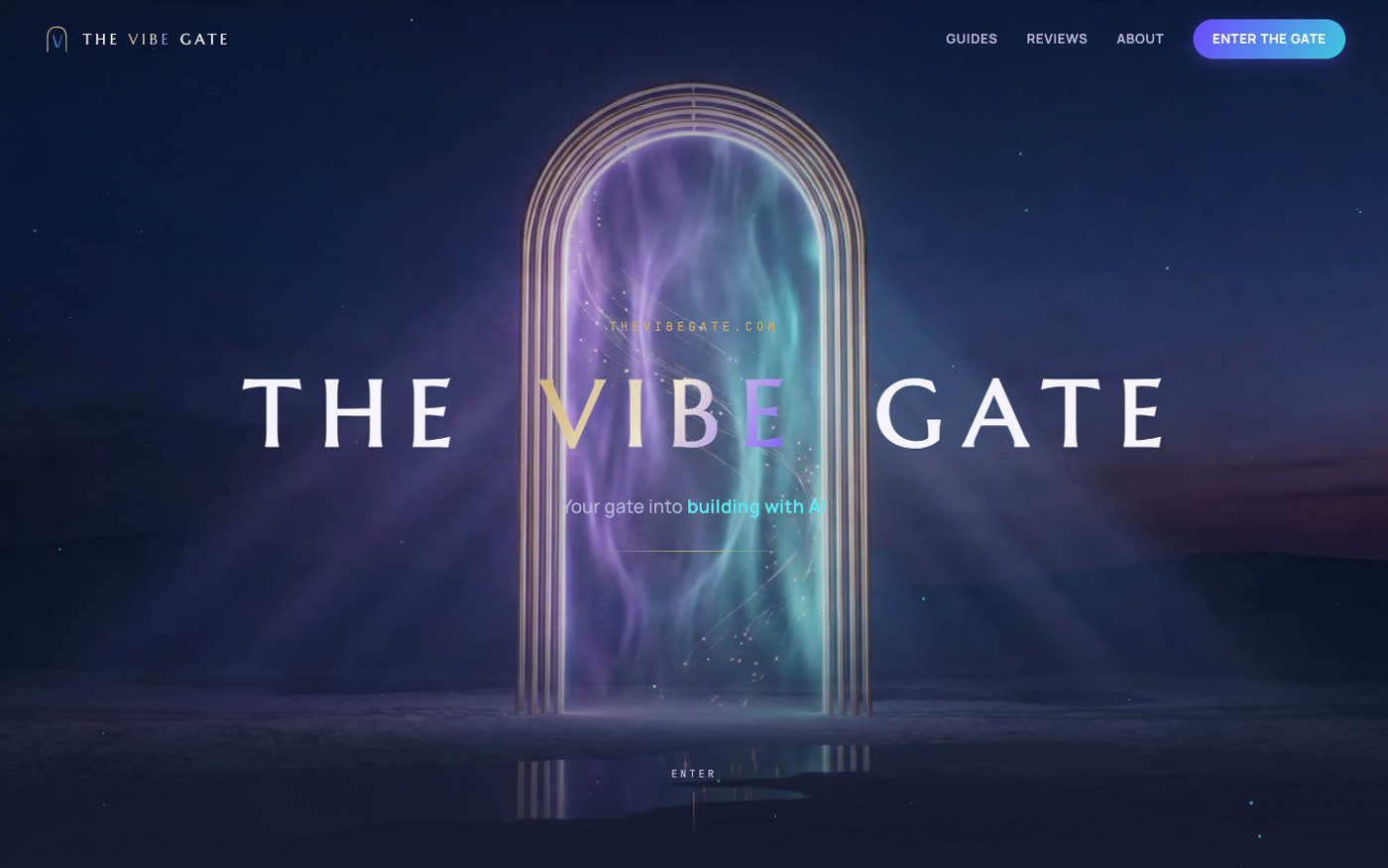
Every part of this site — the glowing gate above, the video that plays as you scroll, the page you're reading right now — came out of a terminal window. I described what I wanted. An AI agent wrote the code. I told it what felt wrong. It fixed things. About forty minutes of that loop, and the page was live on a real domain.
I want to be careful with that claim, because "40 minutes" is exactly the kind of number people use to sell courses. So, the honest version: the page — layout, animations, deploy — took roughly forty minutes of back-and-forth. The brand identity around it (the arch logo, the color system, generating that background video) ate most of an evening. Still absurdly fast for what came out the other end. But let's not pretend it was one prompt and a nap.
This first article is the build log. Real prompts, real mistakes, real numbers. If you've heard the phrase "vibe coding" and rolled your eyes — fair, I did too. Then I shipped a site with it.
What vibe coding actually means here
The term gets stretched to cover everything from fancy autocomplete to "the AI runs my company." Here's the version that actually works: you open an agent that can read files, write files, run commands, and look at its own output — I use Claude Code in a plain terminal — and you talk to it like a very fast contractor. You don't write the code. You steer it.
The skill isn't syntax anymore. It's knowing what to ask for, in what order, and what to reject.
That last part matters more than anything else in this article. The agent produced everything you see here, but it produced it because three of my messages were, in full: "the colors are too dark, I don't love it," "make the logo feel more expensive," and "lighter." Those were design reviews. They worked.
Step one: colors before code
My first prompt wasn't "build me a website." It was a conversation about identity that ended in a small file of design tokens — before a single line of HTML existed:
/* BRAND.md — the part that matters */
--pearl:   #F6F4FB  /* page background — light, not white */
--ink:     #1C1A2E  /* text — violet-black, not #000 */
--violet:  #6D4AFF  /* the one loud color */
--gold:    #C9A96A  /* champagne — thin lines only, never areas */
fonts: Marcellus (wordmark) · Fraunces (headlines) · Manrope (body)
This looks like procrastination. It's the opposite. Once tokens exist, every screen the agent generates pulls from the same palette, so section five automatically matches section one. Skip this step and you get the classic AI-built look: a site where every block seems to come from a different developer's weekend project.
Step two: one long prompt, one working page
With tokens settled, the build prompt was long and specific. Condensed, it looked like this:
The actual prompt, shortened Build a cinematic "scroll-film" landing page for The Vibe Gate. Sticky hero that scrubs a background video as the visitor scrolls — the scroll position is the playhead. Two staged lines during the push-in: "You arrive with an idea." / "You leave with a product." After the gate, transition to a light pearl editorial world: four content pillars, featured guides, a short manifesto, newsletter CTA. Use the tokens in BRAND.md. Lenis smooth scroll, GSAP ScrollTrigger. Then verify everything in a real browser — scroll positions, mobile at 390px, console errors — before telling me it's done.
Two things in there do the heavy lifting. The feeling words ("cinematic," "editorial," "pearl") give the agent a direction it genuinely uses. And the last sentence — verify before telling me it's done — changes the agent's behavior completely. More on that in a minute.
The first draft came back in a few minutes: 379 lines, one HTML file, working. Not perfect — the fonts needed swapping and the hero text fought with the background — but working. Everything after that was steering.
The scroll trick everyone asks about
The hero isn't an autoplaying video. Autoplaying hero videos are wallpaper — your brain files them away and ignores them. Instead, scrolling is the playhead: drag your thumb and the camera pushes toward the gate, stop and it stops.
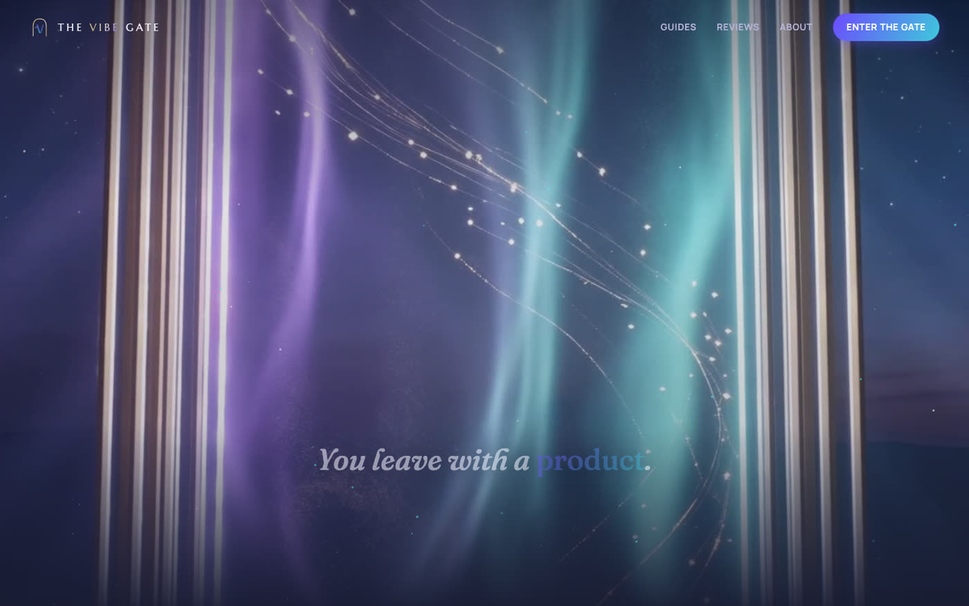
The recipe: an 8-second clip (generated from the hero image so they match perfectly), exploded into JPEG frames with ffmpeg, drawn onto a canvas based on scroll progress.
# explode the clip into scrub frames — set a weight budget first
ffmpeg -i hero.mp4 -vf "fps=15,scale=1440:-2" -q:v 5 frames/f_%04d.jpg

// then: scroll drives which frame gets painted
gsap.to(state, { f: FRAMES-1, snap: 'f', ease: 'none',
  scrollTrigger: { trigger: '.hero-wrap', scrub: .6 },
  onUpdate: drawFrame });
Desktop gets 121 frames at 1440px. Phones get 97 lighter ones. The whole effect is maybe fifteen lines of JavaScript, and it's the thing every early visitor asked about first.
Make the agent check its own work
The biggest unlock of this workflow isn't speed. It's that the agent can look at what it built. After every meaningful change, it launched a headless browser, took screenshots at several scroll positions — desktop and a 390-pixel phone — and read the console for errors.
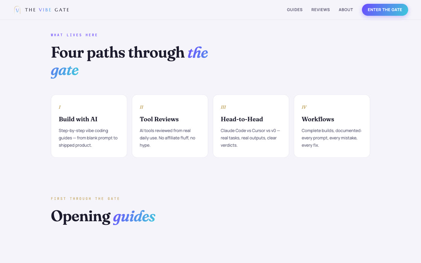
It caught its own bugs before I ever saw them. The site launched with zero console errors, and that wasn't me being careful. It was the loop being honest. If you take one habit from this article: end every build prompt with "verify it in a real browser before telling me it's done." The difference in output quality is not subtle.
Three things that went wrong
1. I almost shipped 18 MB of frames. The first extraction ran at 24fps and 1600px wide — 18 MB of JPEGs for an 8-second scrub. On hotel Wi-Fi that's a slideshow. Re-extracted at 15fps/1440px: 7.2 MB, and while scrubbing you genuinely can't tell. Set the weight budget before extracting, not after.
2. The screenshot tool gaslit us. Mid-build, every screenshot taken after a programmatic scroll came back solid black. Twenty minutes of staring at "broken" code that was actually fine — the capture tool was the problem. We switched verification to Puppeteer and never looked back. When a tool's output looks impossible, distrust the tool before you distrust the code.
3. HTTPS sulked for ten minutes. DNS propagated, HTTP worked, HTTPS refused to connect. The host simply hadn't issued the SSL certificate on its own. One command — vercel certs issue — fixed it in eleven seconds. Deploys are never the hard part. The last two percent always is.
The numbers
| Thing | Reality |
|---|---|
| Active build time | ~40 minutes (page) + one evening (identity & assets) |
| Code | 379 lines, one HTML file |
| Scroll frames | 121 desktop (7.2 MB) · 97 mobile (2.4 MB) |
| Background clip | 8 seconds, 720p, generated from the hero image |
| Console errors at launch | 0 |
| Hosting cost | $0 (Vercel free tier) |
| Image / video generation | $0 (a temporary unlimited promo on Higgsfield) |
| Domain | ~$11/year — the only real money involved |
Should you build this way?
If you can describe what you want — and recognize what you don't — yes. You'll ship things this month that would have taken you a quarter, or that you'd have paid four figures for. The workflow scales down too: the same loop that built this site will build a one-page portfolio in fifteen minutes.
What the agent can't do is want something. Taste is still your job. "Lighter," "more expensive," and "less black" were the three most important lines of code in this entire project, and no model wrote them.
Next up, I'm running the same five tasks through Claude Code and Cursor side by side and publishing the receipts — same prompts, same project, two agents. If you want it when it ships, step through below.